
Shoparel
(CICOM’s fashion wholesale marketplace)
Think of it as a wholesale version of Nordstrom or Macy’s…
My Role
UX Designer / Developer
Tools
Adobe Photoshop
InVision
Visual Studio
Languages
HTML
CSS
JavaScript
My Design Process
Competitive Analysis
-

FashionGo
Strength:
Full-width nav bar with a huge search bar
Mega dropdown has easy brand search feature
Main slider features banner, product images, and brand name
Main page has a unique live TV spot
Plenty of advertisement spots
Weakness
Large side padding (small images)
Product list page has only one view type selection
Product image zoom effect on hover (limited interaction)
-

LA Show Room
Strength
Main page highlights new vendors and has a special deal section
New arrivals are organized in an orderly way - easy to navigate selection
Weakness
Small product images
Main banner has restricted layouts
Product detail pages don’t show zoom-in images
Image ratios can be improved
Large side padding
-

Orange Shine
Strength
Simple and straightforward navigation
Clear guidelines for new vendors
Good product description + extra info
Weakness
Banners don’t change for mobile version
Large side padding
Only one view type for product list page
Main banner slider doesn’t showcase all vendor names
User Personas
Shoparel is in the very beginning phase with relatively few vendors to showcase. We started with three major user personas.
Big Vendor
Has a big branding team, including a videographer, photographer, graphic designer, etc.
Wants to advertise using their video clips and high-quality banners.
Has high graphic images and videos (big files).
Uses marketplace to advertise new season collection.
Needs a platform to spread the lookbook.
Small Vendor
Has a limited team (no graphic designer).
Wants to use advertisement spot but doesn’t have an aesthetic banner.
Focuses on showing as many product images as possible.
Needs to spread awareness of the brand name.
Low-quality images with different ratios.
Buyers
They are busy! Unlike B2C, buyers don’t have bandwidth to focus on each brand’s aesthetics.
Need to buy items in a simple and straightforward way.
Most of them are not browsing. They know which vendors they need to shop at.
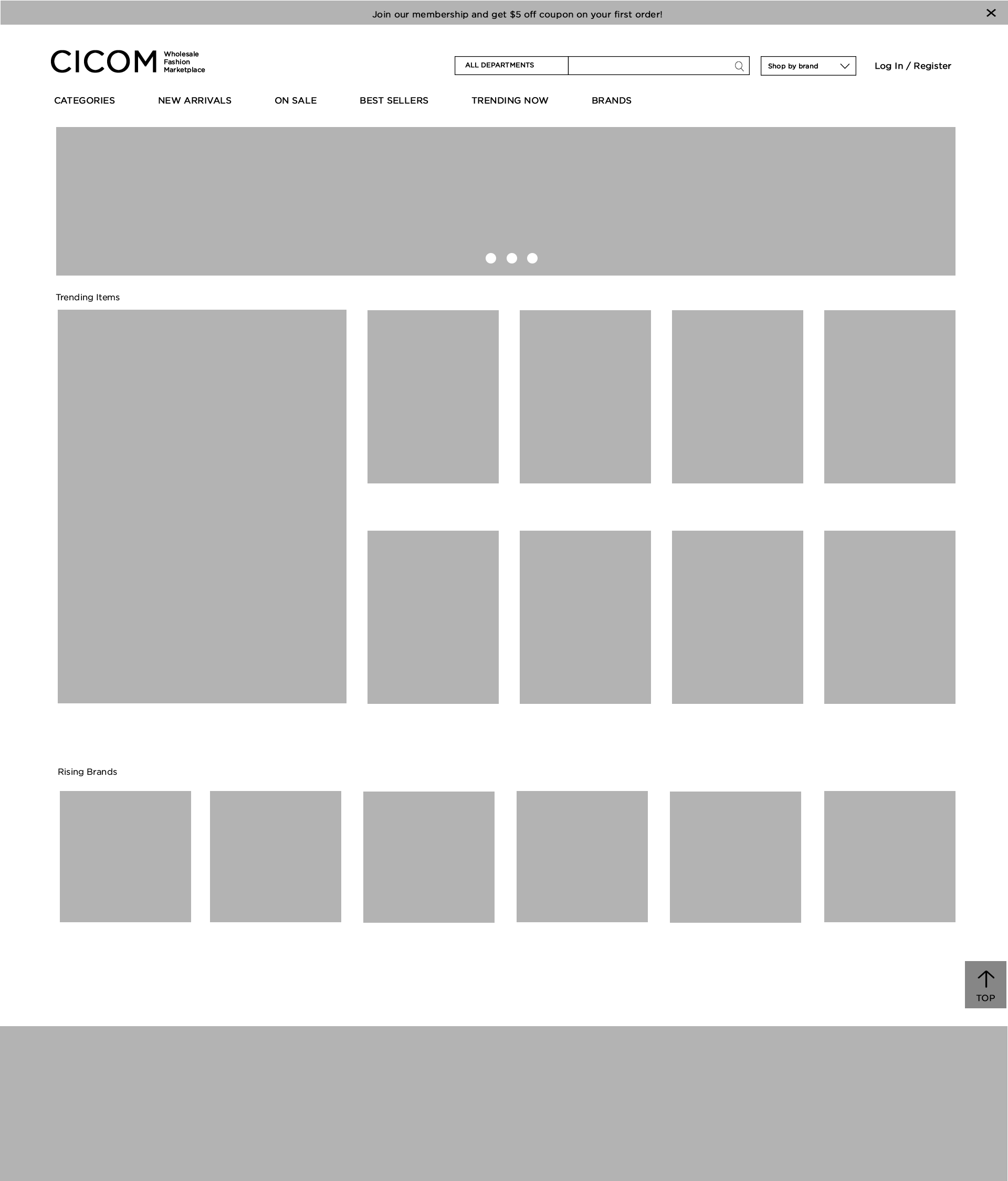
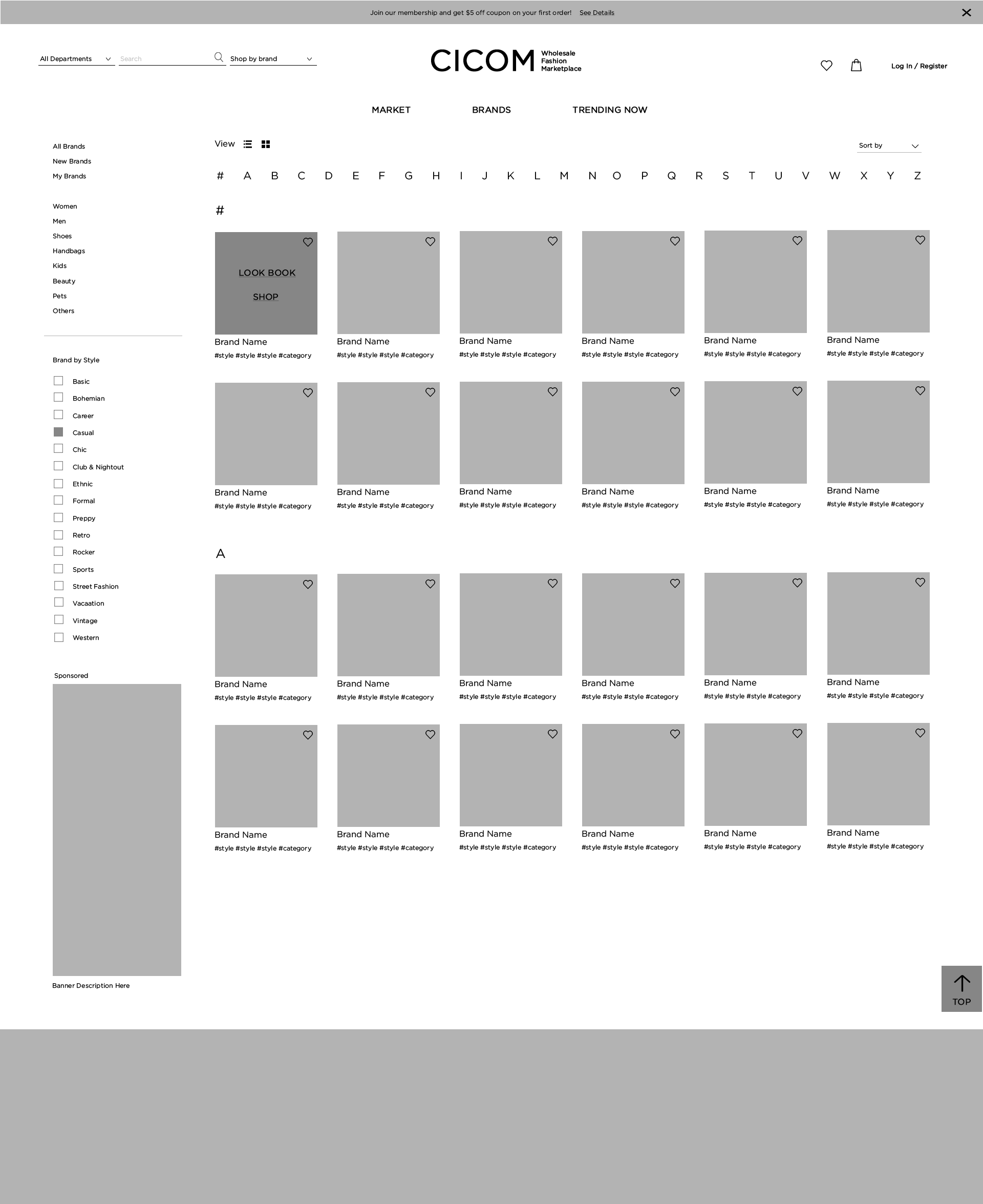
Wireframes + Prototypes
Most of cases, I love working on the user flows using Lucid Chart and Zeplin. For this specific project, CICOM had long experiences working on 40+ B2B online shops, and we had clear visions of user flows. I decided to jump into wireframes to define unique layouts for Shoprael. After leading brainstorming, feedback, and design sessions, I was able to successfully finish prototypes and design guides.


Prototype 1

Prototype 2

Finalized Design - Banner Type 1

Finalized Design - Banner Type 2

Finalized Design - Banner Type 3
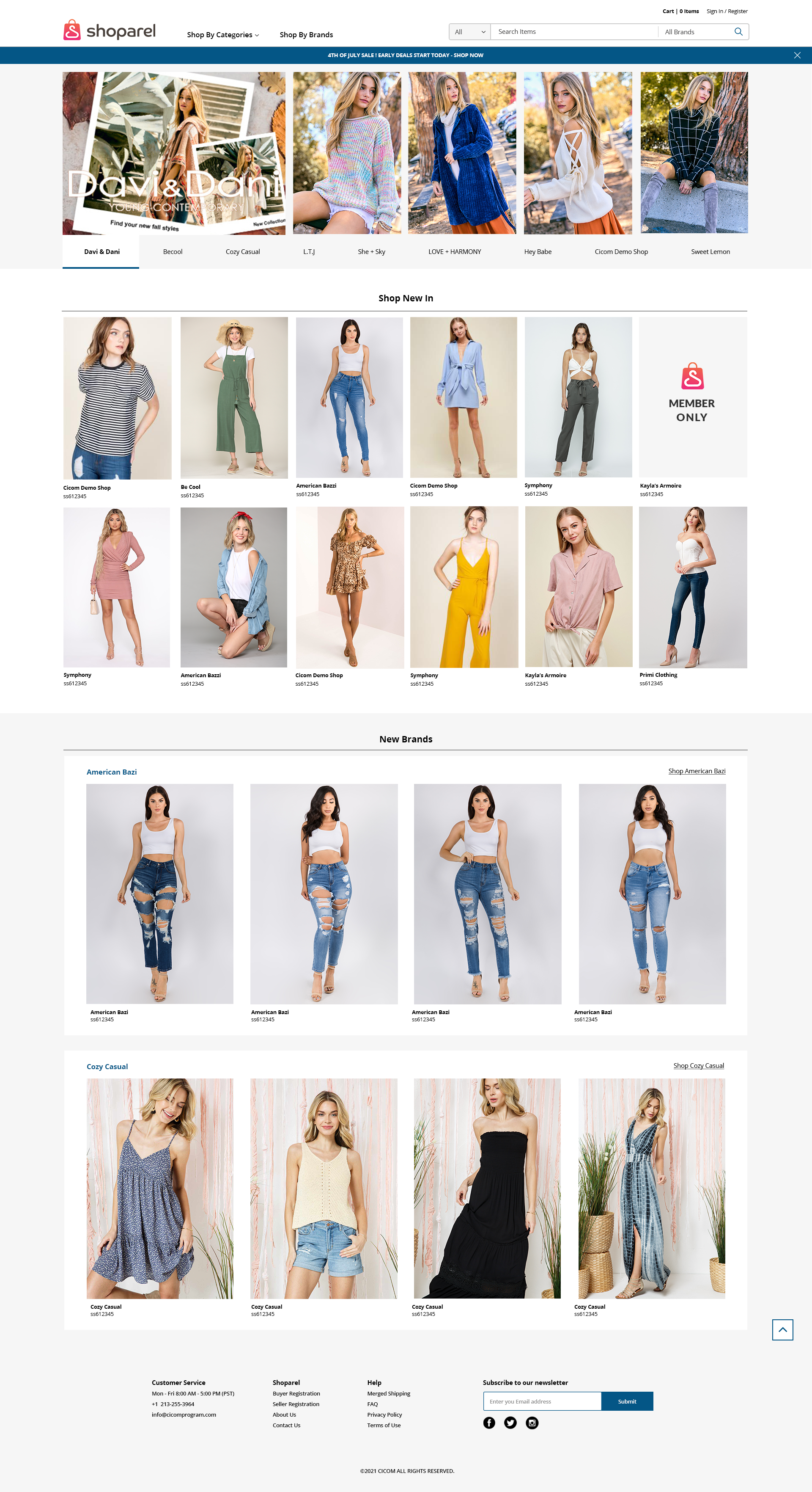
We are transforming a standard B2B marketplace layout! Other direct competitors had large padding for easy responsive development. I designed all pages to be full-width for bigger images and more product photos. Yes, they are all responsive on different screen sizes and browsers. This will both satisfy the buyers’ and sellers’ needs. Did you notice the videos instead of images? I implemented the short product video using Vimeo and Youtube API. Instead of getting a limited zoom-in effect on the hover action, users get to see the preview of the item via a video. For the most important main banner slider, I added different sizes of banner images. Now, the big vendors can choose the banner size, and small vendors can opt not to use banners and simply upload more product images with their logo (See Finalized Design - Banner Type 2).
Aside from designing innovative, responsive UX solutions, I can also build them. I developed every page of Shoparel using HTML, CSS, and Javascript. For the data-binding work, I worked closely with back-end developers to create modular solutions for data.
Testing
Shoparel is currently in the beta testing phase. My team members and I are testing edge cases and sharpening all details. I put on my user persona’s perspective and do all routine operations to find usability flaws. As we continue the in-house testing, we also prepare moderated testing sessions with potential clients. After receiving initial feedback, I’m excited to add more unique shop features and deliver good solutions to fix their problem.